by Laurence | Mar 27, 2008 | Loladex
Lots of blogs covered our beta launch yesterday. Here are some highlights:
• Erick Schonfeld at TechCrunch got things started late on Tuesday evening. TechCrunch is one of the most widely read blogs covering the Web industry.
• The Washington Post’s Kim Hart wrote about us for the Post I.T. blog, and the newspaper’s WashBiz blog also noted our launch.
• VentureBeat weighed in with a Chris Morrison story; the blog is a leading source of news for venture capitalists.
• Darlene Darcy covered the news for the Washington Business Journal.
• Several of the top analysts in the local-search industry wrote about us: Peter Krasilovsky, Greg Sterling, Mike Boland, and Andrew Shotland. Peter’s post was also picked up by the Kelsey Group’s blog, where he works with Mike.
• We were excited to get coverage from local bloggers here in the Washington, DC area: Nick O’Neill of Social Times; Jimmy Gardner of East Coast Blogging; Frank Gruber of Somewhat Frank; Jessie Newburn at Hometown Columbia.
• Also we heard from Adam Metz at MetzMash, who focuses on social media; John Gartner at MarketingShift, an online marketing blog; the folks at KillerStartups; and TLCStudio.
Thanks, everyone, for being interested in Loladex. Did you see coverage anywhere else? Let us know …
by Laurence | Mar 26, 2008 | Loladex
So it’s official: Loladex is open to the world. Find the public beta of our Facebook application at:
http://apps.facebook.com/loladex/
Loladex has changed a lot lately. Thanks to everyone who gave us feedback during our “friends & family” period — we took it seriously!
Here are some highlights:
• The overall look and feel has changed a lot. In particular, we are showing your friends’ faces a lot more. We want Loladex to feel like a community: Rather than being a search engine, it’s a place where friends gather to swap recommendations.
• The home page includes a bunch of new features. We show a nice big scorecard of the picks you’ve made so far, and how you rank among your friends & among all Loladex users. We’re featuring specific picks and comments from your friends in a few different ways. And at the top of the page, we show any current pleas for advice from your friends.
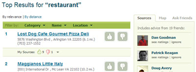
• We’ve upgraded the search results, both in content and in presentation. Importantly, we’ve added a bunch of filters that should help you find exactly what you seek: That was a common request. We’ve also added the ability to “ignore” picks from specific friends and sources, either permanently or on a search-by-search basis. (We don’t allow you to delete friends, however: Please do that via Facebook’s regular process.)
• We’ve raised the visibility of our “ask friends” feature, and made slight changes to how it works. We’ve already gotten some requests to make it even more prominent, so we’ll get working on that. For anyone who hasn’t used it, this feature allows you broadcast a request for advice — maybe you’re looking for a good local accountant to do your taxes, for instance.
By the way, a frequent question I’ve gotten about this feature is, “Can’t you put a module on the Loladex home page that allows me to skip straight to asking my friends?” My concern is that your friends may already have entered the advice you seek — that’s why we want you to perform a search first.
I consider this functionality a moving target, however: Ultimately we’ll be guided by our users. We’ll be looking for feedback in the coming weeks.
• We’ve added recommendations from your Facebook networks — we aggregate all the votes from Loladex users in your region, for instance, or your college alumni network. This functionality is very new, and we need to work on how it’s presented, but I think it’ll be incredibly useful. I welcome your thoughts on how it should work.
• We’ve significantly improved (I hope) the workflow for first-time users. Many people didn’t realize that they could rate anything during their signup process, but thought instead that they were limited to the categories in a dropdown menu. We nixed that menu, raised the profile of the search box, and streamlined the rating process. The streamlined rating process has been applied in several other parts of the site, too.
I think those are the biggest changes. We’ve made tweaks everywhere, of course, and we have plenty more improvements in the pipeline.
Let us know what you think, either here or on our Facebook discussion board.
by Laurence | Aug 14, 2007 | Loladex
The other day I ran into Jay Virdy, a former colleague from AOL Search. He’s signed up to be CEO of Summize, the brainchild of a bunch of smart AOL refugees.
Summize has an innovation, now in beta, that’s both compelling and applicable to local search.
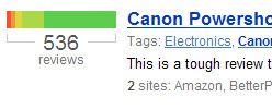
In brief, Summize scours targeted sites for reviews on various items — digital cameras, for instance. It extracts the sentiment of each review and then summarizes its findings in a tremendously compact form, which they call a “snip.” It looks like this:
 This is far more useful than an average star rating — although Summize offers those, too.
The concept pretty much speaks for itself. Still, consider two products: For the first product we have a one-star review and a five-star review, indicating radical disagreement, while for the second product we have two three-star reviews, indicating a rough consensus.
Both products get a three-star average rating, which is misleading. Summize’s snips for the products, however, would look very different from each other, offering a much better summary.
I’m enamoured of this approach, which like many good ideas seems terribly obvious once you see it. I’m campaigning for them to offer it for business listings so I can use it on Loladex.
BTW, Summize is also promoting the meme of “review fatigue,” a malady for which it (naturally) offers the cure. It’s a phrase that neatly evokes the problems of proliferating rate-and-review sites, about which I’ve previously railed.
Summize says the solution is to create a digest of many opinions, and that’s definitely powerful. At Loladex, however, I also want to differentiate between, and prioritize, the sources of opinion — and I’d like to help them become more plentiful and diverse, rather than just harvesting them.
by Laurence | Jun 18, 2007 | Competitors, Local search, Loladex
Palore is a simple browser tool that recognizes when you’re using a local-search site and artfully annotates your results with little informational icons.
An annotated result on Google Maps looks like this (I’ve circled the Palore icons, which wouldn’t normally appear on Google Maps):
 Mousing over an icon gives you a pop-up with more info. The little doctor icon, for instance, shows health-violation data. You might also see reviews, booking links, and more.
This is extremely useful: In essence, Palore is showing Google — and everyone else — how to address some of the weaknesses of a map-dominated interface. (My somewhat outdated post on Google’s UI is here.)
Palore is supposedly in closed beta, by the way, but you can download some specialized versions (kosher, Zagat, “green”) from its home page.
I read about Palore a while ago and thought it was a great idea — which is another way of saying that it’s kinda like Loladex. Apparently it has done very well in Israel, where it started.
When I finally got around to downloading it today, however, I found that the specialized versions don’t appear to include the most important feature: The ability to pick & choose which icons get displayed, and how they get displayed — to switch off everything except the health-violation icon, say, or to put the menu icon first.
Maybe this functionality is in the non-specialized version? Certainly it’s implied by Palore’s home-page text:
- “Use Palore to see the things you care about when looking for restaurants and other local businesses online”
- “Choose from dozens of information-icons that will instantly appear in any search site you use”
Yup: That’s what I want! So why can’t I do it?
Assuming the “real” beta works the way I’d like, or at least that it ultimately will, here are my nominations for what else could be better about Palore — which I really do admire, by the way:
- I’m sure Palore hears this from everyone: No one wants to download a browser add-on. It’s pretty painless, but it’s still a psychological hassle & it limits their potential audience. Airfare metasearcher Sidestep went this route for years until, in essence, it was forced to change its focus by fast-growing competitors such as Kayak. Sidestep still offers a plug-in, as well as a Google toolbar with integrated Sidestep functionality, but both options are buried in its destination Web site — as they should be. Palore is building its model on a behavior that its users will adopt only grudgingly.
- Very much related: Palore adds information to other sites’ search results, but it doesn’t allow me to adjust the results themselves. If Palore knows that I care about vegetarian restaurants, for instance, it knows that Google Maps’ #9 result is much more relevant than the #1 result. But as the user, I’ll still need to scroll down to realize this fact. Worse, the most relevant result may be on the third (or thirtieth) page of results.
- Both of the above complaints amount to the same thing, I guess: Palore would be better off building a destination site. The local-search space is still wide-open, and they should have the courage of their convictions. Maybe they figure they’ll get more traffic by piggybacking on established sites, but I bet they’re wrong.
- Palore doesn’t seem to be exposing an API that would allow anyone to power an icon without their mediation; instead, you’re asked to contact them about “partnering opportunities.” No matter how streamlined their process is, it’s more limiting than do-it-yourself. Not very 2.0.
- Palore seems overly focused on restaurants. (They address this in their blog.)
- A minor quibble: Palore doesn’t work on Yahoo Maps, because Yahoo Maps is built in Flash. That’s a big traffic source, and could really benefit from Palore icons. But of course I’ve already recommended that they move away from this model, so I can’t complain much. And I don’t think it’s addressable, anyway.
Having said all this, I must add that I hope Palore doesn’t read this post — or, if it does, that it doesn’t take my advice. If it did, I’d have a scary competitor.
by Laurence | May 31, 2007 | Being a startup, Local search, Loladex
A fashionable critique of many startups right now is: “Isn’t what you’re planning really just a feature?”
This is a polite way for people to say that you’re doomed.
The logic is that, ultimately, your functionality will be emulated by, and subsumed into, a larger offering — usually a search portal, although these days Facebook and MySpace also get mentioned a lot.
Since users are creatures of habit, this critique goes, they’ll want to get your functionality from a site they already use, rather than learning how to use a new site.
Besides, isn’t a search (or social) portal a better place to execute on your idea, since it can integrate users’ existing information & preferences?
This critique is most often made by money men, and generally means that they believe you’re too risky because …
- Your standalone business model (if you have one) can be blown away at any time by Google, or whomever; and/or
- You’re counting on an acquisition that can’t be planned for.
Of course, in a world where Google is trying to do everything, it’s practically impossible not to be accused — and with some validity — of building a feature rather than a product.
But the same was true of PC applications and utilities, not to mention browsers, in the age of Microsoft, and that didn’t mean it was dumb to start a business back then.
(Hmmm. Or maybe it did?)
Meanwhile, Google itself started with a product that was arguably “just a feature” of a larger site: For years, Web search was outsourced as such by Yahoo.
And long before that, IBM believed that Microsoft’s operating system was just a feature of the personal computer.
So how seriously should I take this critique, which I’m sure will be applied to Loladex? Because I’m certainly not counting on being Google or Microsoft.
Well, local search is already a “feature” of all the major search portals; almost by definition, then, a specific element of local search (the social aspect) is even more so.
And those portals have an entrenched position that’d give pause to any rational person.
On the other hand, the true power and meaning of certain “features” becomes evident only when they are placed front and center.
MySpace and Facebook are a good example: They took what could legitimately be seen as a “just a feature” of AIM (or AOL or Yahoo) — the user profile page — and, by reimagining it as a social hub, popularized a new paradigm.
The same thing could have happened at AIM, and maybe should have, but didn’t. Why? Because to AIM it was just a feature.
Same story, albeit on a smaller scale, with Flickr, which is about to replace Yahoo Photos, a service for which Flickr’s sharing aspects might once have been “just a feature.”
I suppose it’s fair to say that Loladex’s core functionality (which I don’t yet want to describe in detail) is a feature of Yahoo Local, or of Google Maps, or even of Yelp.
For sure, it already exists in some form on all those sites.
Where I differ from these sites, however, is that I don’t think it’s “just” a feature. I think it’s the most important feature — and that its potential will be realized only when it’s treated as such.
This, I believe, is a legitimate reply to the “just a feature” critique.*
Simply having a head-start against, or better execution than, a search portal — or, God forbid, imagining you’ll be acquired by one — isn’t a reasonable plan.
But if you claim that your functionality should be central to the competing sites for whom it’s now, or could be in the future, “just a feature,” then you’re staking out a defensible position.
If you’re right (still a gamble!) your competition will have to change something fundamental in order to compete, which is hard for a bigger company to do.
*Another legitimate defense, by the way, is to take the long view:The Web is becoming atomized and — led by MySpace — portals are morphing into places where users assemble a personalized set of features that they’ve gathered from around the Web.
As widgets and feeds become mainstream, focusing on a specific feature is a valid long-term plan as long as there’s a business model behind it.
In this new world, the smart portals won’t bother competing with specific features. Things will be much more symbiotic: Portals will vie to provide the best platform for integrating third-party features, the best tools for communication, and the largest collection of your buddies.
If you can leverage this emerging infrastructure, then building “just a feature” will no longer be a bad thing.
by Laurence | May 17, 2007 | Local search, Loladex, Social search
The folks at Local Matters in Denver, led by Perry Evans, just launched a beta version of their new site, LocalGuides.com. It’s an interesting take on “local social,” based on many of the same observations that are inspiring Loladex.
I’ll write more about this site after I’ve had a chance to dig into it, but my first impression is that (a) they are absolutely going in the right direction; and (b) there are a few blind alleys along the way. Oh, and (c) parts of it are too heavily monetized in a phone-booky way.
I was very nervous to look at LocalGuides.com last night, because Perry is a smart guy and I knew he’d be in the same ballpark as Loladex — except earlier by half a year. I’m not quite as nervous now; they’ve taken a somewhat different approach.


 This is far more useful than an average star rating — although Summize offers those, too.
 Mousing over an icon gives you a pop-up with more info. The little doctor icon, for instance, shows health-violation data. You might also see reviews, booking links, and more.