The pernicious influence of Google Maps
Now don’t get me wrong: Maps are an important element of local search. What’s more, Google Maps was a force for good when it launched, and possibly still is.
But when it merged its mapping and local products, Google cemented a meme that’s been pushing local search into too narrow a channel, both for Google itself and for the competitors it influences.
The meme, in short: Local = map.
Or worse, local = big honking map.
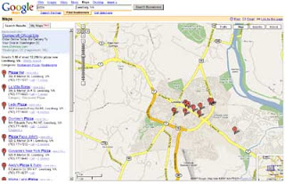
Here’s a (shrunken) screengrab from Google Maps for my classic sample query, [ Pizza ] near [ Leesburg, VA ]:

Presumably Google thinks the map is the most important thing on this page. On my screen it takes up ~75% of the space, and it expands along with my browser window.
By contrast, the results column on the left — the actual most important thing on the page — is constrained to 300 pixels. Even if I make my window bigger, it won’t get any larger.
Now compare the information that’s available from each of these two elements — the immediate payoff. The results column is information-rich, and is meaningful as a standalone element. That’s a high payoff. But the map is meaningless without either (a) looking at the left column; or (b) clicking on one of the stick pins.
Furthermore, the map can’t simultaneously display all of the information that’s being shown in the results column. I’d need to click the map ten times to expose it all — if the stick pins were all clickable, that is, and not stacked on top of each other.
And of course, a map might not even be relevant to my results. When I search for “pizza,” I may be interested in the exact location of each matching business. But when I search for “plumber,” or even “pizza delivery,” I’m probably not — what matters is service area, which is only roughly related.
In other words, Google’s map may seem like a strong visual summary, because that’s how we usually think of maps, but it’s actually very ineffective. It looks nice, to be sure, but it’s a terrible waste of space.
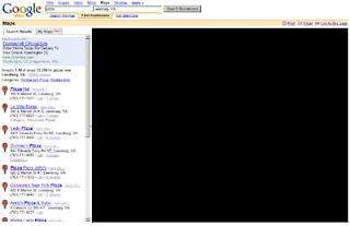
Black it out, and what have you lost?
 Very little, I’d argue. The same can’t be said about the results column:
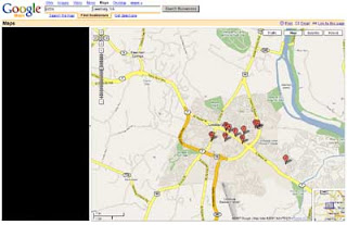
 This doesn’t mean there shouldn’t be a map on the page, of course. I don’t even object to the size of the map, per se. The problem is that Google has left only 300 pixels in which to do everything else — which, as a practical matter, means it can’t do much.
Take Google’s new “My Maps” functionality, which launched the other day. It’s kinda interesting and philosophically in sync with Loladex. But of necessity it’s hidden behind a tab in the left column, where I can’t imagine it’ll have a chance to flourish.
That’s a real shame (except maybe for Loladex).
Indeed, Google can’t fit much except names and addresses in 300 pixels, which seriously limits the evolution of its product.
It can innovate within the map, I suppose, but IMO a map simply isn’t a good vehicle for displaying a result set in which the content of individual results is neither uniform nor already known by the user.
Supplementing or illustrating such a result set, yes — but not displaying it.
Not all of Google’s competitors are quite so constrained by their own maps, but it’s just a matter of degree. Google has framed the debate, as it so often does, and now any product without a huge map on the results page seems somehow … suspect.
Needless to say, Loladex won’t have a results page that’s overwhelmed by a map. Maps will enrich our site, but they won’t determine its shape.
